How to use the HEAT map to browse risks?
08 Jul, 2026
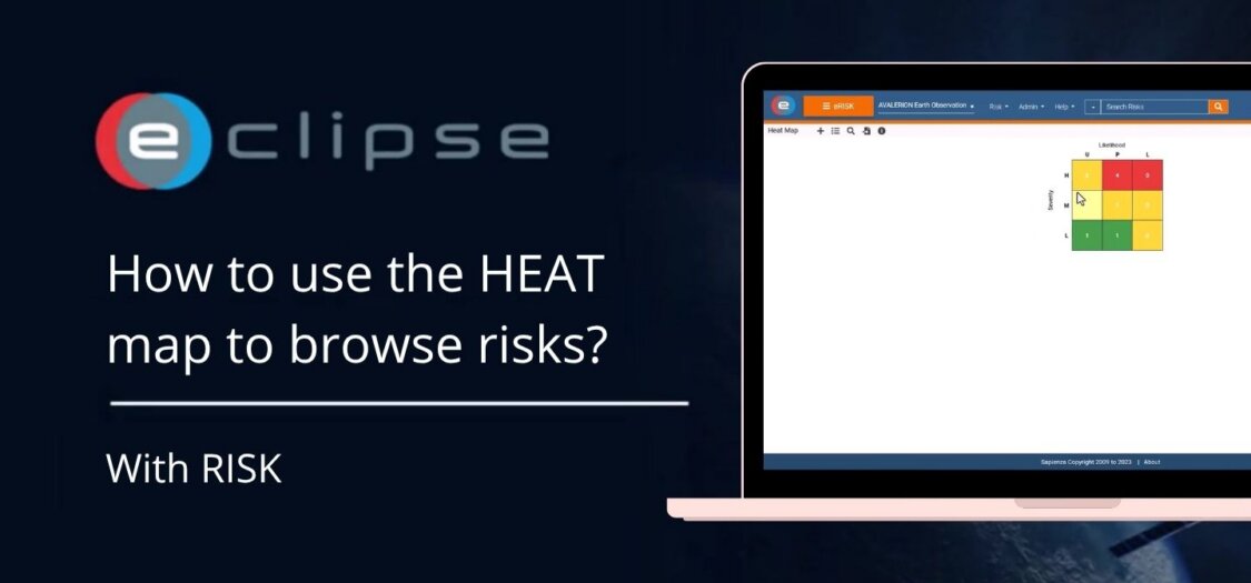
The HEAT Map in the Risk Management (RISK) module provides a visual overview of project risks based on their likelihood and severity. It allows you to quickly identify high-priority risks and navigate directly to the associated risk records.
In this video, we demonstrate how to use the HEAT Map to browse and review risks.
What is the HEAT Map?
The HEAT Map displays risks in a matrix where:
- The horizontal axis represents the Likelihood of a risk occurring.
- The vertical axis represents the Severity (or impact) of the risk.
- Each numbered box indicates how many risks are currently assigned to that risk level.
- The colour of each box helps identify the overall risk level:
- Green – Low risk
- Amber – Medium risk
- Red – High risk
This provides an instant overview of the project’s overall risk profile.
How to use the HEAT Map
- Open the Risk Management (RISK) module.
- Navigate to the HEAT Map.
- Review the matrix to identify where risks are distributed based on their likelihood and severity.
- Hover over or select a numbered box to see how many risks belong to that category.
- Click a box in the HEAT Map to display the corresponding risks.
- Browse the list of risks associated with the selected risk level.
- Open a risk from the results to review or update its details.
What can you do with the HEAT Map?
- View the overall distribution of project risks.
- Quickly identify high-risk areas.
- Browse risks by their likelihood and severity.
- Open individual risks directly from the selected category.
- Prioritize mitigation efforts based on the project’s current risk profile.
Result
The HEAT Map provides a clear visual representation of your project’s risks, making it easy to identify critical risks and navigate directly to the relevant risk records for further review or action.